

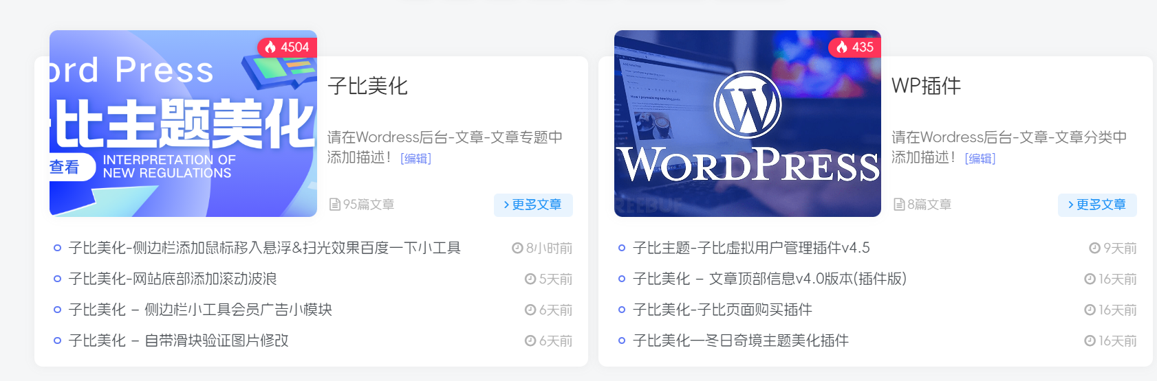
这是一个子比主题小工具分类聚合卡片,今天看到别的站点这个挺好看的,然后就弄了下来,今天分享给大家!原作者是狐狸库!!
演示效果:
![图片[1]-子比美化 – 专题&分类聚合卡片上移](https://cdn.dreamren.cn/wp-content/uploads/2025/06/683a4d1a58cb8da5c81e70fd.png?imageMogr2/format/webp/blur/1x0/quality/100)
代码部署:
将下面的CSS样式加入到主题的自定义CSS代码中,两个样式,二选一
.clearfix .zib-widget.term-aggregation .term-img {
width: 18.5em;
}
.clearfix .zib-widget.term-aggregation .term-img .graphic {
margin-top: -40px;
}
@media screen and (min-width:1024px) and (max-width: 1240px) {
.clearfix .zib-widget.term-aggregation .term-img {
width: 19.8em;
}
.term-title .em14 {
display: none !important;
}
.term-title .text-ellipsis-2 {
display: none !important;
}
}
@media screen and (min-width:768px) and (max-width:1023px) {
.clearfix .zib-widget.term-aggregation .term-img {
width: 14em;
}
.term-title .em14 {
display: none !important;
}
.term-title .text-ellipsis-2 {
display: none !important;
}
}
.term-aggregation .term-img {width: 18.5em;}.graphic, .page-cover {margin-top: -40px;}@media screen and (min-width:1024px) and (max-width: 1240px) {.term-aggregation .term-img {width: 19.8em;}.em14 {display: none !important;}}@media screen and (min-width:768px) and (max-width:1023px) {.term-aggregation .term-img {width: 14em;}.em14 {display: none !important;}/*.text-ellipsis-2 {display: none !important;}*/}@media screen and (min-width:425px){.clearfix {padding-top: 20px;}}本站资源均为网友推荐收集整理而来,请勿商业运营,仅供学习和研究,请在下载后24小时内删除!!
© 版权声明
THE END
![「子比美化」给导航菜单添加自定义徽章及多种样式菜单设置方法[图文教程]-追梦人](https://cdn.dreamren.cn/wp-content/uploads/2025/06/20250617115832544.webp)

